If you were to ask people generally what some of the biggest learning challenges they’ve ever faced were, it’s a good bet that many would bring up studying languages. While some people just seem to have the ability — the language gene, so to speak — most people find it very difficult to engage with new languages, stick with the learning process, and retain the information. This makes it somewhat fascinating to consider how, then, a service like Duolingo, designed to be a modernised language-learning tool, can establish and maintain such a massive base of users. After all, wouldn’t it seem likely that most people would either brush past it or try it a few times and then forget about it?
To some extent, it’s the core concept of Duolingo that makes it a success. Learning a language via app and through a step-by-step, occasionally game-like process is simply more appealing to a lot of modern users than the standard classroom or language-on-tape methods. However, beyond the core concept, Duolingo also thrives by way excellent UX design. In this piece, we’ll explore this idea from a practical standpoint, looking at how to go about your own UX design, the example of Duolingo, and how you can put it to use.
Going About UX Design
Before we address the Duolingo example specifically, it’s a good idea to consider a brief refresher on how to go about UX design in the first place, so that you can begin to think about how you might implement changes based on this or any other positive example.
UX design begins with your own preferences, intuition, and decisions as you build up your website and ready it for release. It will be up to you to make pages appealing, make navigation clear, and generally provide the foundation for a site that will be a pleasure for visitors to interact with. However, beyond these basic starting points, there are more technical means of establishing strong UX design today as well. The UXArmy toolkit for design and user testing can help you specifically to improve navigation and, perhaps most importantly, gather feedback from external sources who may spot deficiencies you don’t see. Tools like these come closer to automating the UX design process and ensuring that you start off strong.
Beyond starting off strong, it’s also a good idea to equip your site with the resources it will need to handle adjustments to UX down the line. Sometimes, these adjustments are easy enough to make. In other cases though, they might require more involved editing that, if you’re unprepared, can be a burdensome and disruptive process. Here, too, modern tools can help. Specifically, Updatable explains how to make instant updates to any part of your site that may need them, simply with the help of man app or live page editor. Tools of this sort none exist to enable changes as needs arise, and without deep development action or code disruption. They can be invaluable in helping you to follow up on your initial UX design.
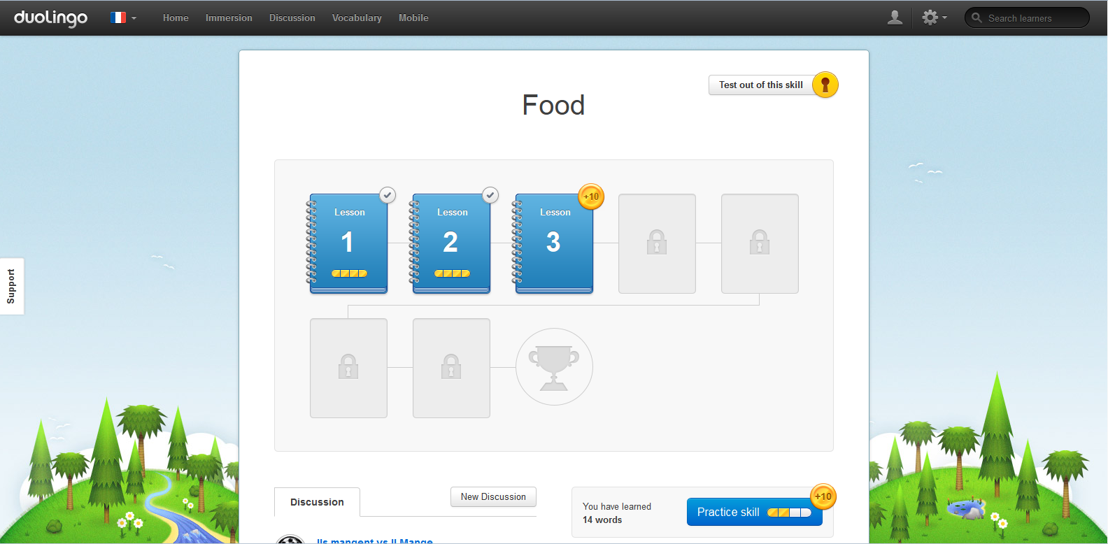
What Makes Duolingo A Strong Example
Now that we’ve offered a refresher on some of the basics, we’ll get back to the example, and specifically take a look at what makes Duolingo a service worth looking at in this regard.
UX Collective explained Duolingo’s usability and did a nice job of identifying four main features that make for an effective, appealing user experience:
That doesn’t mean Duolingo is necessarily flawless. For instance, some (including the author of the piece at UX Collective) describe conflicted feelings about the service’s semi-interactive mascot, who can be somewhat annoying. Others have gone back and forth on different aspects they’d like to see regarding chat; A Medium piece explored the idea of a chatbot in detail, but broadly, some would like a bot to make the service even more usable, and others would like more of a user-to-user, in-app chat option so as to make the program more communal.
There will always be examples of how a given site or app can serve its users more effectively though. By and large it’s the features above that make Duolingo a particularly user-friendly service.
Drawing From Duolingo
As for what you can take from the Duolingo service in your own UX design efforts, it’s true that many of the features described above are fairly specific to a tool for learning languages. That said, you can still use the breakdown of Duolingo’s success as a sort of road map for what you want to achieve, not in terms of specific features but rather regarding the impression you leave.
Is your app or website easy to “learn” from the outset? As in, does it effortlessly guide the user further along? Are menu options and calls to action clearly defined and inviting? Is the user’s personal attachment to the experience visible in some way (even if that means clear access to a profile or personal history)? These are the more general questions you can ask based on how effective a service like Duolingo is at providing a good customer experience.
Remember though, as a final note, not just to assess questions like these on your own. We’ve discussed in a previous post on UXArmy the price of not user testing, and it’s something everyone working on an online service ought to consider. So, as you go about looking at more examples and working through your UX design, don’t forget that vital step of making sure the actual users are going to like the results!
About our Guest writer Zea Allen
Zea Allen is a senior CX specialist consulting for some of the Fortune 500 companies. Always chasing the next UX and CX paradigms, she does freelance consulting to broaden her horizons. When not working, she’s out practicing her figure skating routines.