Color in UI design is one of the most powerful tools a designer has. Long before typography, grids, or animation enter the picture, color sets the tone, communicates meaning, and guides attention. Yet many designers treat it as instinct rather than skill. The difference between guesswork and mastery lies in understanding the foundations of color theory, the psychology of color, and how to apply both in the contexts of branding, UI, print, and product design.
In this guide, we’ll cover the essentials of color usage in design. You’ll not only learn the theory, but also see bad vs. good applications, practical examples, and image references you can use and credit in your own work. Think of this as both a foundation and a toolkit – so whether you’re a junior designer or an experienced creative looking to refine your craft, this is your go-to reference.
Ready to build that trust and kickstart your research?
let’s make trust the foundation of every project you work on.
The Foundation: Color Theory 101
Every strong design practice begins with understanding the science and art of color.
The Building Blocks of Color
At its simplest, color is how our eyes and brains perceive light waves. We organize this perception using the color wheel, a circular map first formalized by Sir Isaac Newton.
Primary Colors
Subtractive (Pigment-Based: RYB)
- Used in painting, print design, and traditional art.
- The three primaries are: Red, Yellow, Blue
- You can’t create these by mixing other colors; They are the “source” hues.
- When you mix them, you get secondary colors (see below).
Additive (Light-Based: RGB)
- Used in screens, UI, mobile, and digital design.
- The primaries are: Red, Green, Blue
- When combined at full intensity, they produce white light.
- These are the base for all on-screen color mixing.
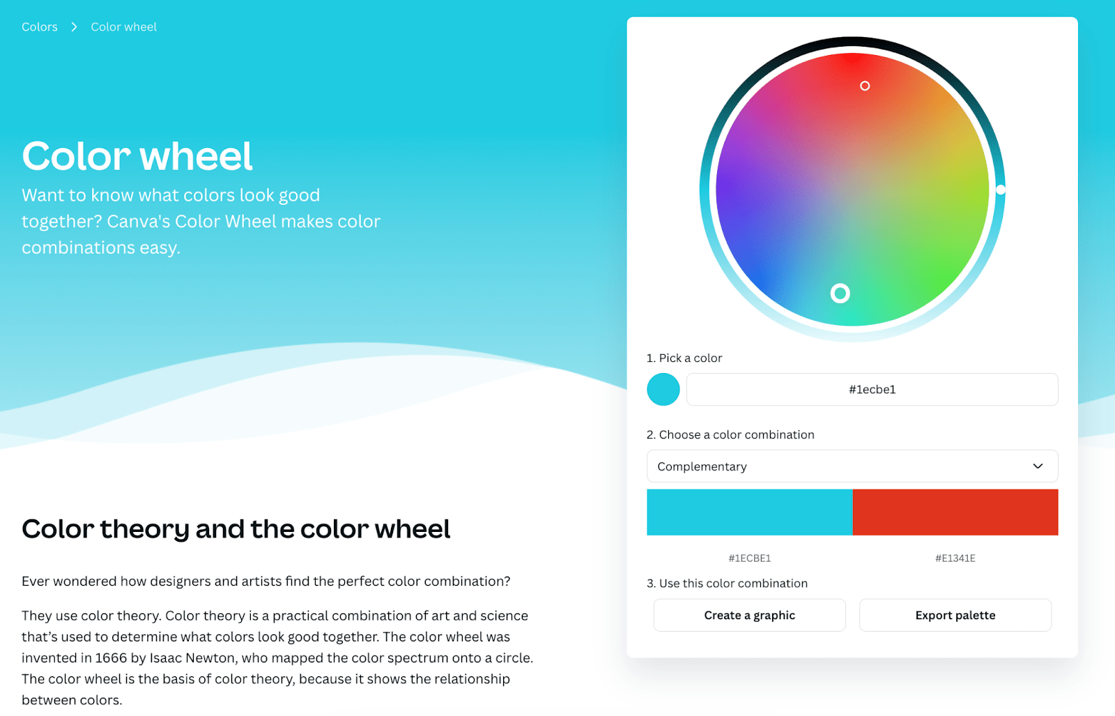
Image Reference: Canva’s Interactive Color Wheel is a practical tool for designers to play with additive/subtractive color harmony. Try the Canva colour wheel here
Secondary Colors
When you mix two primaries, you get a secondary color. These are:
- RYB (Pigment-Based):
- Red + Yellow = Orange
- Yellow + Blue = Green
- Blue + Red = Purple
- RGB (Light-Based):
- Red + Green = Yellow
- Green + Blue = Cyan
- Blue + Red = Magenta
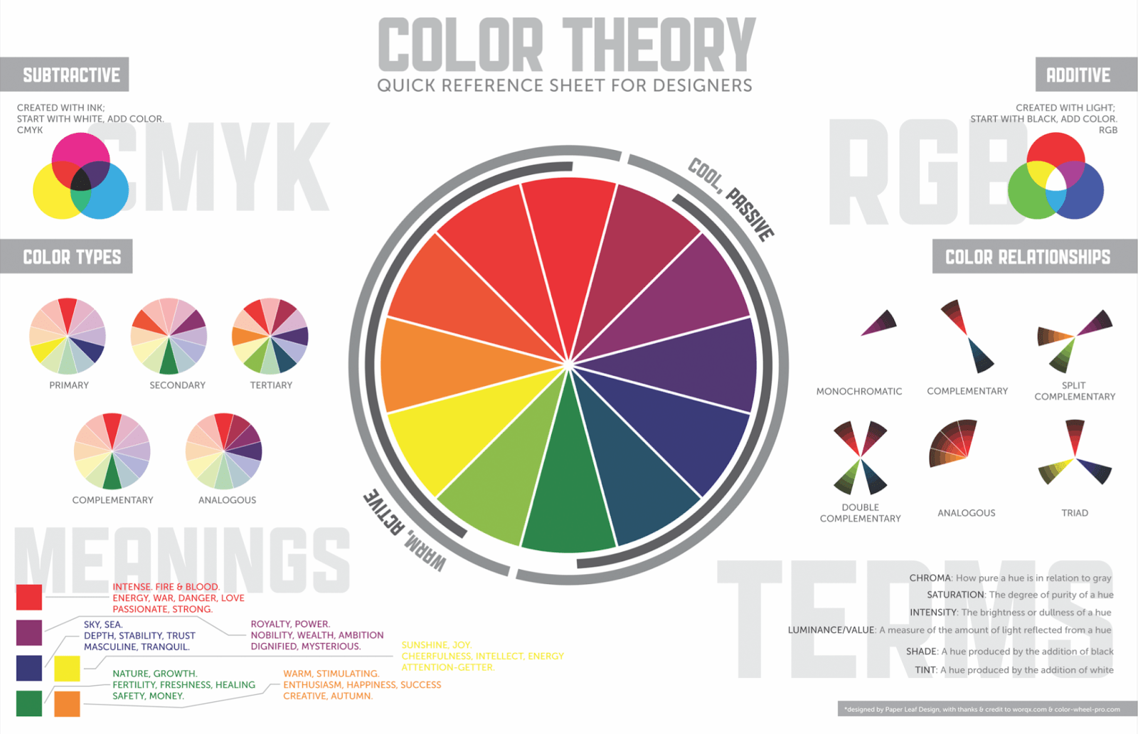
Image reference: Paperleaf’s Color Theory Quick Reference Poster (Munsell.com) – a globally shared infographic summarizing color harmonies and theory. To download this graphic as PDF file, click here
Tertiary Colors
Tertiary colors are created by mixing a primary with a neighboring secondary. These fill in the rest of the color wheel and create nuance.
- RYB Examples:
- Red + Orange = Red-Orange
- Yellow + Green = Yellow-Green
- Blue + Purple = Blue-Violet
- RGB Examples:
- Green + Cyan = Spring Green
- Blue + Magenta = Violet
- Red + Yellow = Orange
These are the “in-between” shades that give your palette subtlety and variety.
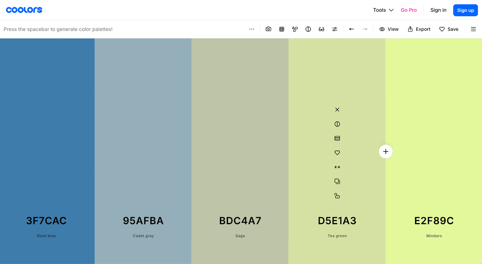
Image Reference: Coolors Palette Generator is a playful tool that helps you see how tertiary shades work in real palettes. To play around with Coolors Palette Generator, click here.
Why This Matters for Designers
- Branding: You need to understand primaries vs. secondaries to build a coherent brand palette (e.g., using a primary for hero elements, a secondary for accents, and a tertiary for backgrounds).
- UI Design: Knowing additive color helps you design accessible, screen-friendly color hierarchies.
- Print: Understanding subtractive color ensures your on-screen designs print accurately.
Pro Tip: If you’re designing for both print and screen, always test your palette in both RGB (for digital) and CMYK (for print) to make sure colors translate correctly.
Harmonious Color Schemes
Knowing how to build harmonious color palettes is like learning the chords in music. Just as musicians rely on patterns for balance and tension, designers use color schemes to create compositions that feel intentional rather than chaotic. Here are the most common schemes every designer should know, with practical examples.
Complementary Colors
- Definition: Colors that sit directly opposite each other on the wheel (e.g., blue & orange, red & green).
- Effect: High contrast, energetic, eye-catching.
- Best for: Call-to-action buttons, sports branding, bold posters.
- Design tip: Use one as dominant and the other as an accent to avoid visual “fighting.”
Analogous Colors
- Definition: Colors that sit next to each other on the wheel (e.g., blue, blue-green, green).
- Effect: Cohesive, natural, soothing.
- Best for: Nature brands, health apps, editorial spreads.
- Design tip: Use varying brightness/saturation to keep things dynamic, not flat.
Triadic Colors
- Definition: Three colors evenly spaced on the wheel (e.g., red, yellow, blue).
- Effect: Vibrant, balanced, lively.
- Best for: Playful branding, children’s products, entertainment.
- Design tip: Pick one dominant, two supporting. If all three fight for attention, it gets overwhelming.
Monochromatic Colors
- Definition: Variations of a single hue using tints (with white), shades (with black), and tones (with gray).
- Effect: Elegant, restrained, calming.
- Best for: Minimalist designs, luxury brands, portfolio websites.
- Design tip: Introduce texture, pattern, or scale to add variety.
Split-Complementary Colors
- Definition: A base color + the two colors adjacent to its complement. (e.g., blue + red-orange + yellow-orange).
- Effect: Strong contrast, but less tension than direct complements.
- Best for: Digital dashboards, infographics where balance + readability matter.
- Design tip: Anchor with the base hue, use the two split complements sparingly.
Tetradic (Rectangular) Colors
- Definition: Four colors arranged in two complementary pairs. (e.g., red/green + blue/orange).
- Effect: Rich, varied, bold.
- Best for: Complex designs like event posters or multi-category apps.
- Design tip: Assign hierarchy – don’t give equal weight to all four.
Why This Matters for Designers
- Brand identity: Schemes help you craft palettes that communicate stability (analogous), luxury (monochromatic), or energy (complementary).
- UI design: Balanced schemes improve readability, accessibility, and visual hierarchy.
- Print: Harmonies ensure cohesion when layouts span multiple spreads or collateral pieces.
The Psychology: Understanding Color’s Impact
Color isn’t just visual – it’s psychological. It shapes how people feel, behave, and interpret design.
Color and Emotion
- Red: Urgency, energy, passion (Coca-Cola, Netflix).
- Blue: Trust, calm, professionalism (IBM, Facebook).
- Yellow: Optimism, youth, caution (McDonald’s arches, Ikea).
- Green: Growth, balance, eco-friendliness (Starbucks, Spotify).
- Purple: Luxury, creativity, spirituality (Cadbury, Twitch).
- Black: Power, elegance, mystery (Chanel, Nike).
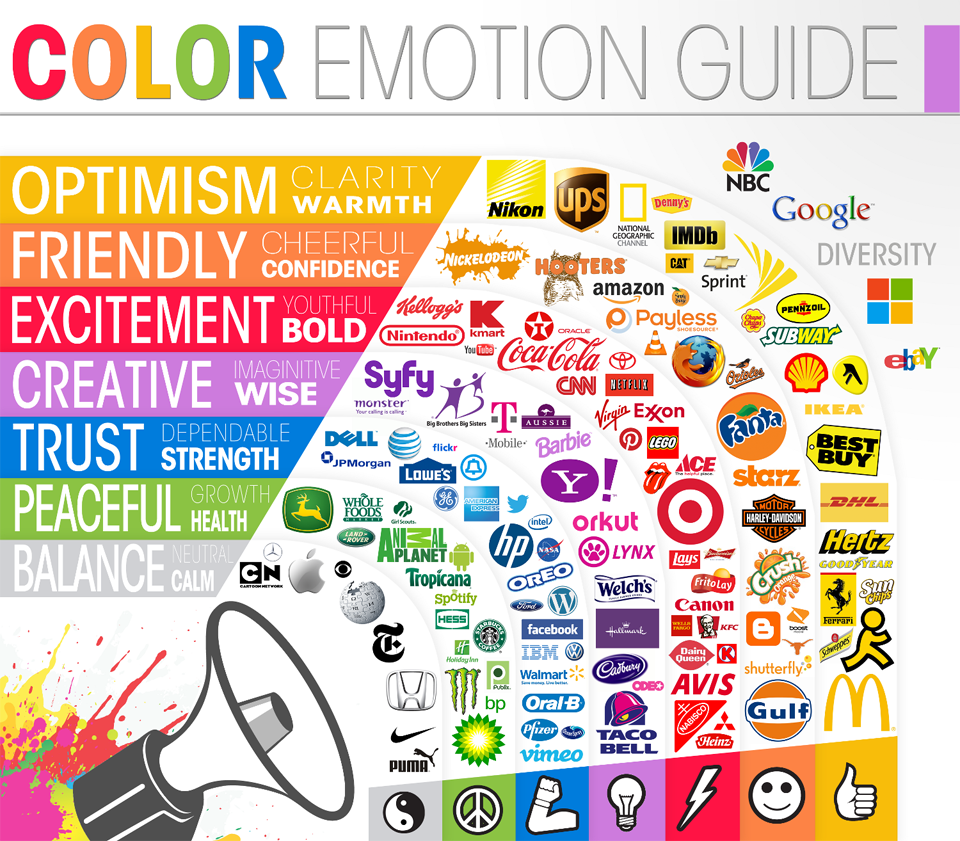
Image Reference: Color Emotion Guide Infographic from Logo Company, a logo design firm, helps clearly illustrate what emotions are invoked by certain colors using the logos from top brands as an example.
Cultural Specificity
Be careful: colors don’t mean the same thing everywhere.
Color doesn’t speak a universal language. While some associations are rooted in biology (e.g., red as a signal for danger or attraction), many meanings are culturally constructed – and can vary widely across regions. For designers working on global products or campaigns, overlooking these nuances can result in designs that feel tone-deaf, alienating, or even offensive.
White
- Western cultures (U.S., Europe): Purity, weddings, peace. Brides wear white dresses.
- Eastern cultures (China, India, Japan): Mourning, funerals, death. White is associated with endings rather than beginnings.
- Middle East: Purity but also spirituality and sometimes mourning, depending on the country.
A wedding ad designed with a white-dominant palette. In the U.S. it signals purity, but the same ad in India could be mistaken for a funeral notice.
Red
- China: Prosperity, luck, celebration (red envelopes during Lunar New Year).
- South Africa: Mourning and political struggle.
- Western cultures: Passion, urgency, danger (think of stop signs, fire alarms).
- Middle East: Danger but also sometimes associated with evil or caution.
A banking app mockup using red as its brand color. In China, it feels auspicious and strong; in South Africa, it risks associations with mourning and loss.
Green
- Islamic cultures: Sacred, holy, strongly positive.
- Western cultures: Nature, eco-friendliness, “go” signals.
- Indonesia: Traditionally forbidden to wear in some rural areas due to local beliefs.
- Mexico: National pride (green is part of the flag).
A sustainability brand using green as its hero color resonates globally, but in rural Indonesia could accidentally signal taboo.
Blue
- Western cultures: Trust, calm, professionalism (banks, tech brands).
- China: Associated with immortality and healing.
- Middle East: Protection against evil (seen in amulets like the Nazar).
- Latin America: Sometimes linked to mourning or religion (Virgin Mary).
A fintech startup using blue signals safety in the West – but in Latin America, its religious undertones might shift interpretation.
Yellow
- Western cultures: Optimism, youth, caution (traffic warnings).
- Japan: Courage and nobility.
- Egypt: Mourning.
- China: Traditionally reserved for emperors (imperial power).
A cheerful yellow campaign for a youth brand in the West feels playful, but in Egypt could unintentionally reference grief.
Black
- Western cultures: Death, mourning, sophistication (luxury fashion).
- Africa (varies by country): Age, maturity, masculinity, but also mourning.
- China: Health and prosperity (though sometimes also secrecy or evil).
- Japan: Formality and mystery.
A luxury perfume ad in black-and-gold feels elegant in Paris but could evoke death or secrecy in parts of East Asia.
Designers’ Takeaway
- Research your audience. Never assume color meanings transfer universally.
- Test your palette. Run small focus groups in target regions before finalizing.
- Be flexible. Consider adapting palettes regionally (e.g., Coca-Cola adjusts red shades slightly in some countries for cultural fit).
- Look for neutrals. Blues and greens are often safer globally, while reds, whites, and blacks carry more variance.
Designers working on global products must validate palettes against cultural contexts.
The Application: Color in the Real World
This is where theory and psychology translate into practical design choices.
Branding & Identity
A brand’s color palette is its personality.
- Starbucks green signals calm, natural energy.
- Tiffany’s blue evokes exclusivity and heritage.
- Google’s multicolor conveys openness and playfulness.
Web & Mobile UI: Designing with Color for Usability
Color in UI is never just decoration. It’s a functional language that communicates hierarchy, interactivity, and accessibility. For UX and UI designers, poor color usage can mean lost conversions, user confusion, or even complete task failure.
Here are key principles, examples, and best practices:
Visual Hierarchy
Color creates a clear path for the eye.
- Good example: Headlines in a darker hue, secondary text in muted gray, and CTAs in a contrasting accent.
- Bad example: Using similar saturation for all text, everything competes, nothing stands out.
Call-to-Action (CTA) Clarity
The CTA is where color earns its paycheck.
- Use a single accent color for CTAs across the experience to train users where to click/tap.
- Avoid using your CTA color for unrelated elements (like headers).
Accessibility & Contrast Ratios
Color choices impact inclusivity. According to WCAG 2.1:
- Text contrast ratio minimum = 4.5:1 (normal text), 3:1 (large text).
- Don’t rely on color alone – add icons, underlines, or labels.
Bad practice: Pale gray text on white => stylish but unreadable for low-vision users.
Better practice: Dark navy on white with a subtle underline => both stylish and legible.
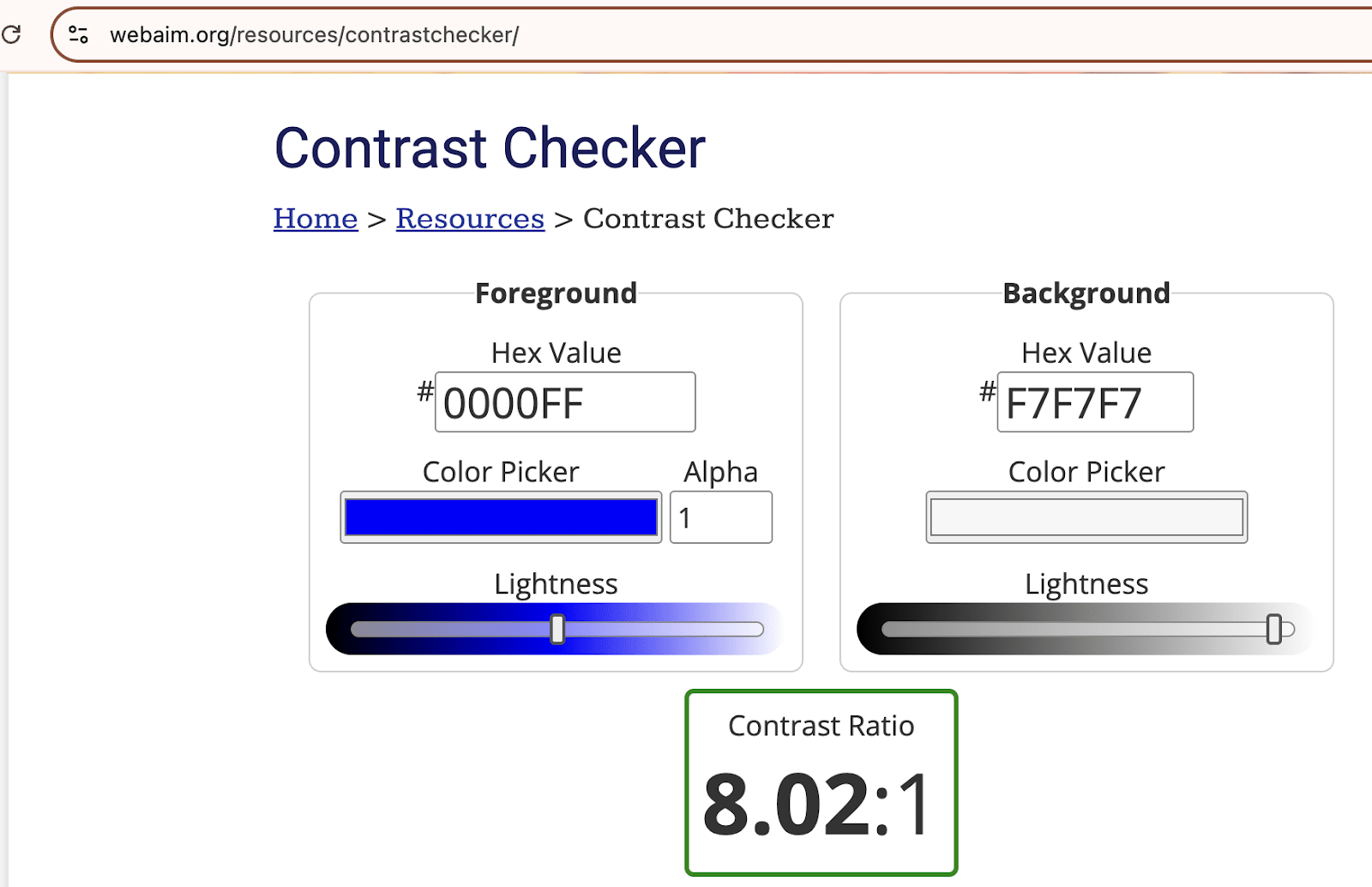
Reference: WebAIM Contrast Checker is a trusted global tool for testing accessibility compliance.
State Indicators & Feedback
Color communicates status in UI:
- Green: Success (payment processed, task complete).
- Red: Error, urgent warning.
- Yellow/Amber: Caution or pending action.
- Blue: Informational messages.
Image description: Notification panel with four alerts:
- Success banner in green.
- Error banner in red.
- Warning banner in amber.
- Info banner in blue.
Pro Tip: Always pair icons + text with color so users with color blindness can interpret meaning.
Mobile Context: Small Screens, Big Constraints
On mobile, space is limited, so color carries more weight.
- Use fewer accent colors. Stick to 1 to 2.
- Avoid oversaturated palettes that overwhelm small displays.
- Leverage system dark/light modes – ensure your colors adapt gracefully.
Consistency Across States & Platforms
Users should learn your color “language” once.
- Buttons: same accent color across web and mobile.
- Links: always styled consistently (blue + underline, or a branded equivalent).
- System states (errors, warnings, success) should be coded with the same hues in both mobile and desktop apps.
Designer’s Takeaway
For UX/UI design, color is function:
- Drives hierarchy (what’s important now).
- Signals interactivity (what can I tap/click).
- Communicates status (success/error/info).
- Ensures inclusivity (legible to all users).
Think of your palette not just as aesthetics but as a system. Just as typography has rules for headers and body, color needs rules for CTAs, states, and backgrounds. Document these in your design system so that color usage stays consistent across teams and touchpoints.
Graphic Design & Print
Print vs. screen = different color behaviors.
- Print (CMYK) absorbs light => muted, matte.
- Screen (RGB) emits light => vibrant, glowing.
Product Design
Physical objects carry tactile perceptions.
- Matte black phone = premium, durable.
- Bright yellow speaker = fun, approachable.
Same form, different personality.
How UI Designers Harness AI in Color Design
Artificial Intelligence is rapidly changing how designers work with color. What used to take hours of moodboarding, palette testing, and accessibility checks can now be automated, accelerated, and even intelligently suggested. But that doesn’t mean designers can abandon color theory – if anything, understanding the principles becomes more important when collaborating with AI.
AI-Powered Palette Generation
- What it does: Tools like Adobe Firefly, Khroma, and Colormind can generate complete palettes from a single image, keyword, or mood prompt.
- Why it matters: A designer can type “vintage coffee shop branding” and instantly get harmonious palettes.
- Designer’s role: You still need to understand why one palette communicates “warmth” (browns, creams, deep reds) and another feels “fresh” (greens, soft blues).
Example tool: Khroma. AI trained on your personal preferences to suggest usable palettes.
Accessibility and Contrast Checking with AI
- What it does: AI-enhanced design systems (like Stark for Figma or Adobe’s accessibility plugins) can flag low-contrast combinations in real time and suggest compliant alternatives.
- Why it matters: Saves time compared to manually testing dozens of ratios.
- Designer’s role: Knowing WCAG guidelines (4.5:1 ratio for body text) ensures you choose appropriate corrections rather than blindly trusting the AI.
Contextual Color Suggestions
- What it does: Generative AI models can recommend palettes based on use cases (e.g., “banking app dashboard” vs. “kids’ game UI”).
- Why it matters: It accelerates exploration for moodboards and early prototypes.
- Designer’s role: Color psychology knowledge helps you validate: Is that cheerful yellow playful – or is it too distracting for a financial app?
Speeding Up Iterations
- What it does: Tools like Figma AI can instantly apply multiple palette variations across a design system.
- Why it matters: Lets designers test 10 possible themes in minutes instead of days.
- Designer’s role: You must still evaluate contrast, hierarchy, and cultural fit – things AI cannot fully judge.
Where AI Falls Short (and Why Theory Still Matters)
- Cultural nuance: AI doesn’t always account for cultural specificity (e.g., red = luck in China, mourning in South Africa).
- Accessibility beyond contrast: AI may pass color contrast but fail to consider color-blind-safe palettes.
- Emotional resonance: AI can mimic “happy” or “calm,” but without theory, you can’t validate whether the tone truly aligns with your brand goals.
Key Takeaway:
AI is like an assistant, not a replacement. It’s great for exploration, acceleration, and automation, but the designer’s eye and knowledge of color theory remain essential for ensuring the result is usable, inclusive, and emotionally on-brand.
Credible AI + Color Resources You Can Link/Reference:
- Khroma: AI Color Tool
- Colormind.io: AI Color Palette Generator
- Stark for Figma – accessibility checker with AI help
- Adobe Firefly
The Action Plan: Best Practices & Credible Resources
Top Tips from Masters
- Josef Albers (Interaction of Color): “In visual perception, a color is almost never seen as it really is.”
- Johannes Itten (The Elements of Color): Focused on subjective color experience.

Image description: All the gray rectangles are the same lightness. The effect of simultaneous contrast is to make the ones on the light background seem darker than the ones on the dark background.
The Designer’s Essential Library
Here are 3 books admired by Designers and are in their list of recommended reads.
- Interaction of Color – Josef Albers.
- The Elements of Color – Johannes Itten.
- The Secret Lives of Color – Kassia St. Clair.
Tools & Systems
- Pantone: Global standard for consistency.
- Munsell Color System: Scientific approach to organizing hue, value, chroma.
- Adobe Color: Online color scheme builder.
- Coolors: Quick palette generator for digital designers.
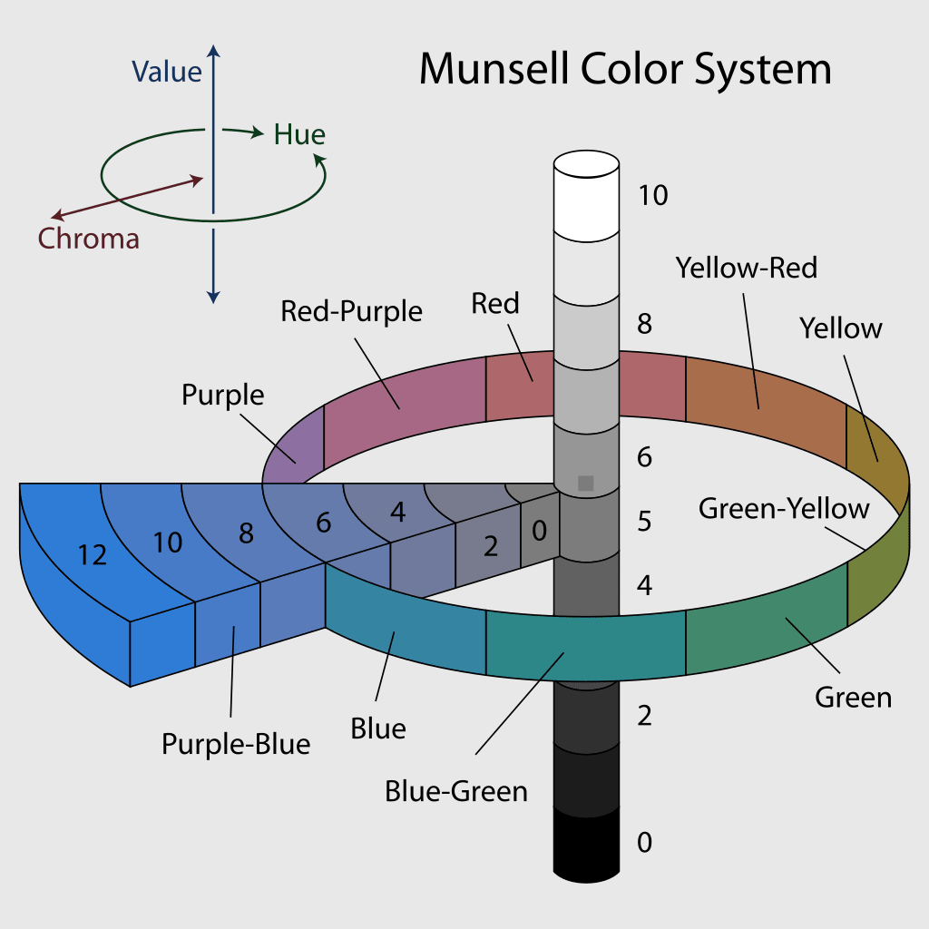
Image description: The Munsell color system, showing: a circle of hues at value 5 chroma 6; the neutral values from 0 to 10; and the chromas of purple-blue (5PB) at value 5.
Conclusion and recommendations
Color is not just a finishing touch. It’s a strategic design tool that influences how people feel, behave, and connect with your work. From the scientific foundations of color theory to the emotional power of psychology, from cultural nuance to practical UI applications, and even with the rise of AI-assisted design tools, the principles remain the same: designers must use color deliberately, not accidentally.
If you’re just starting out, revisit Color Theory 101 to anchor yourself in the building blocks of primary, secondary, and tertiary colors, and explore Harmonious Schemes to practice building palettes that feel balanced.
If you’re already comfortable with the wheel, take a deeper dive into Color Psychology and Cultural Specificity. Understand not just what a color looks like but what it means in different contexts and cultures. This knowledge is what separates a visually “pretty” design from one that is truly empathetic and global.
For UX/UI designers, your next step is practical: apply these principles in Web & Mobile UI design. Ensure your palettes drive hierarchy, CTAs, and accessibility, not just aesthetics. And don’t miss the section on AI-powered design: it’s here to speed up exploration, but it can’t replace your judgment about accessibility, psychology, or cultural fit.
Finally, bookmark the Best Practices & Resources. Whether it’s revisiting Albers and Itten, checking Pantone trends, or experimenting with tools like Adobe Color, Coolors, or Khroma, these resources will sharpen your eye and strengthen your process.
When used with purpose, color becomes your most persuasive design element, capable of creating delight, building trust, and sparking action. Master it, and your designs won’t just look good, they’ll speak fluently to your users across screens, cultures, and contexts.
Try UXArmy for free.
Experience the power of UXArmy
Join countless professionals in simplifying your user research process and delivering results that matter
Frequently asked questions
How many colors should I use in a UI design?
Most design systems work best with a core palette of 3 to 5 main colors: a primary, a secondary, a neutral, and one or two accents. Adding more risks visual noise and confusion. For complex products (e.g., dashboards), you can extend with semantic colors (success, warning, error, info), but the rule of thumb is: keep it simple and consistent.
How do I make sure my color palette is accessible?
Check contrast ratios using tools like WebAIM Contrast Checker. Body text should meet 4.5:1, large text and UI elements at least 3:1. Also, never rely on color alone! Pair red error states with icons or labels, so color-blind users don’t miss important information.
Do I still need to learn color theory if AI tools generate palettes for me?
Yes. AI can speed up palette exploration (Adobe Firefly, Khroma, Colormind), but it doesn’t always account for psychology, cultural nuance, or accessibility. Designers who know theory can judge when AI’s suggestion is aesthetically pleasing but functionally flawed. Think of AI as your assistant, not your replacement.
How do I choose the right color scheme for a brand or product?
Start with the brand’s personality and values. Ask: Should it feel trustworthy (blues, muted tones), playful (bright triadic palettes), or luxurious (deep monochromes, black + gold)? Use harmonious schemes like complementary or analogous for balance, and then test with users to validate if the colors align with their perception.
What are common mistakes UI/UX designers make with color?
1)Using too many colors without hierarchy.
2)Poor contrast (gray text on light backgrounds).
3)Over-relying on cultural assumptions (e.g., white = purity everywhere).
4)Mixing brand and system state colors (e.g., CTA buttons that look like error states).
5)Ignoring dark mode adaptations.
A good fix is to define color tokens in your design system so CTAs, states, and backgrounds always behave predictably.
What are the principles of design in color?
There are twelve basic principles of design: contrast, balance, emphasis, proportion, hierarchy, repetition, rhythm, pattern, white space, movement, variety, and unity. relates to the visual weight of elements in a composition.
What are the rules for UI design color?
60–30–10 Rule
60% is your dominant hue, 30% is a secondary hue, and 10% is for an accent (typically the primary color). This is a good rule of thumb with most UI design, especially when you’re first starting out. Reference from How to create a better UI color palette.
What is the 3 color design principle?
The 3 color rule is simple: pick one primary color. Then, pick two other complementary colors. See the example below. We picked a main hue (a variation red), and complemented it with two different colors.


